If you’re relatively new to website management, you may have heard the term “above the fold”. Website layouts have a lot of terms, but arguably none as important as above the fold, so let’s talk about what it is, why it matters, and what you should do.
What Is Above the Fold
In website terms, above the fold refers to the section of a web page which is visible when someone first opens it. In other words, it’s the visible bit of a web page without any scrolling down.
This is the most important part of any web page, because unless someone sees what they’re looking for as soon as that page loads (which hopefully loads quickly – check out my easy guide on how to increase website speed in WordPress), they’re going to leave that page.
Not only have you lost a potential customer or reader in that case, but Google and other search engines will note their quick exit and take that as a sign that you shouldn’t be ranking for the keywords which brought that person there in the first place. This can cost you rankings and traffic.
So even if you have the content that person is looking for, if it’s not apparent to them above the fold on that page, it’s doing you no good.
Fortunately the solution is simple enough.
Above the Fold – Website Tutorial
The number one rule in above the fold website design is to be sure that every page of your site has everything your visitor needs without having to scroll down.
By default, most of the most important content on your site is at the top, including your logo and your menu.
As an (albeit obvious) aside, your menu should feature the most important pages on your site you want to drive traffic to. Whatever your reasoning for having that website, it needs to be well represented here.
Your website should also be easily navigable by way of this menu. Including a search bar in this area or at the very least above the fold ensures that someone can access virtually every page of your site from every page of your site with little effort.
If you have an email signup field, you should also include it above the fold so again, it’s visible on every page without any scrolling necessary.
Now, with regards to content, you obviously can’t always feature it above the fold.
In other words, the “meat” that people want on your page when they click through from Google can’t always exist at the top of the page/above the fold.
This is why it’s essential that you create a table of contents for your post or page featuring anchor links at the top of your page. This is especially important for longer posts which cover a lot of different content.
This TOC should be clearly visible above the fold regardless of what device someone is viewing your page on.
These anchor links are live links which, when clicked, take you instantly to that corresponding part of the page.
How to Make Same Page Links
I did an entire tutorial showing how to easily make an anchor link in WordPress, so refer to that for a more detailed explanation.
Suffice to say, though, it’s a two step, very easy to do process.
You simply create an anchor tag for the section you want to link/jump to, then create the link from the word(s) you want to jump to that section, like in your table of contents.
The best way to use this navigable TOC on a page is to write a very short intro paragraph confirming what that page is about, promise the resolution the user is looking for, then offer the TOC before getting into the content.
There’s a good example of a TOC in action on my SEO for YouTube guide:
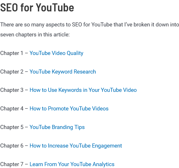
It looks clean, it divides the content in an effective way, and it’s convenient. It allows the visitor to quickly skip to the specific part of the page they’re looking for rather than having to wade through lots of content they don’t want.
Most people use Google with the intent of quickly finding what they’re looking for, and this helps them do that once they get to your site.
Consider the Browser
One last thing to mention is to keep in mind that your pages will look different in different browsers and on different devices.
This means that what is above the fold on your website will vary from user to user.
While you could check it using your various devices manually, you can get a much better idea using a free cross browsing tester.
Not only will this show you any above the fold website issues, it can show if certain elements of your website aren’t loading properly in a particular browser or on a particular device.
In Conclusion
Above the fold website design is something to keep in mind as you’re creating your website or even a specific page.
Designing your site or a page so that everything someone might be looking for is accessible without any scrolling will earn you more time on your site.
This will in turn improve your rankings as Google sees this user behavior as a sign that you’ve got good content worthy of ranking well (see 6 types of user engagement in Google Analytics that can make or break your rankings).
Just put yourself in the shoes of someone coming to that web page every time you create a new one and think of what they are looking for. Once you know that, just make sure it’s easy to access from the start.
You’ll be amazed at the effect this can have on your bounce rate, the amount of time people spend on your site, and your Google rankings!